Why
Pantone?
The Pantone Matching System (PMS)
is an internationally recognized color reproduction system. A Pantone color can
be reproduced with exactly the same color output regardless of different
manufacturers or different locations. Basically this means that when you use a
Pantone color in your designs, printers will be able to reproduce exactly the
same color time and again. CMYK colors, by contrast, can have slight
variations depending on the software used to generate them and the technique
used to print them.
That might sound a bit too specific,
but you’ll actually find that Pantone colors are incredibly useful and are
widely used across professional design and print businesses. A common example
where you might want to opt for a Pantone color is if, say, you’re designing
branded items for a company that has a particular brand color. If you don’t
want that color to be reproduced slightly differently across business cards,
letterheads, signage, etc., a Pantone color will ensure that the brand color
will always appear consistent.
Some key things to know about
Pantone colors before we get started with creating them:
- Pantone colors are spot colors—spot colors are printed on a separate print run to CMYK process colors, so this can increase the costs of printing your design.
- Pantone colors are identified by a number in the Pantone Matching System—a couple of additional letters following the number refer to the paper stock that you’ll be printing on. Different Pantone colors are adapted to different paper stocks (e.g. coated, uncoated), as the paper stock can affect the appearance of the printed color.
- Fun Fact: Each year Pantone declares a particular color ‘Color of the Year’, based on Pantone’s forecast for consumer color trends for the year ahead. For the first time ever, Pantone announced two colors for the 2016 Color of the Year title, Rose Quartz and Serenity.
Read on to find out how you can
create Pantone colors in Adobe software. We’ll be creating the swatches
directly in Adobe InDesign, but we’ll also look at how you can
share a saved Pantone palette with Adobe Illustrator and Adobe
Photoshop.
2.
How to Create Pantone Swatches
Pantone swatches are surprisingly
simple to create in Adobe InDesign using the Swatches panel.
Let’s explore how...
Step
1
Open up Adobe InDesign, and
create a new document for Print. Any page size and number will do, as
we’ll just be using the document to create our swatch palette.
Expand the Swatches panel (Window
> Color > Swatches).
Select and delete all of the default
CMYK color swatches sitting at the bottom of the list of swatches, using
the trash can button at the bottom of the panel.
Step
2
Select New Color Swatch from
the panel’s drop-down menu.
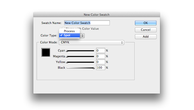
In the New Color Swatch
window, change the Color Type from Process to Spot.
From the range of options in the Color
Mode drop-down menu, choose the appropriate Pantone type. Let’s say we are
planning to print on coated paper (as opposed to uncoated matte paper). In that
case, we would choose PANTONE + Solid Coated.
Step
3
You’ll notice that InDesign has now
loaded a huge range of Pantone colors into the PANTONE menu below*.
*Top Tip: Unless you’ve been given a specific Pantone number to locate
by a client or colleague, it’s recommended that you should first refer to a
Pantone color book to help identify the color you’d like to use. Even if you’ve
calibrated your screen, the colors as you can see them on the computer may
appear different to your printed result. To ensure you don’t get a nasty surprise,
they’re worth the investment!
You can either scroll through the
colors, which are ordered numerically, or type into the text box above to bring
up a specific Pantone swatch in the menu.
Click on your selected swatch, click
Add to add it to the Swatches panel, and then click Done
to exit the window.
And there you have it! You’ve added
your first Pantone swatch to the Swatches panel.
Step
4
You can continue to add Pantone
swatches to the Swatches panel using the same process.
If you’re planning on using your
Pantone swatches for the same print job, or related jobs, make sure to stick
with the right Pantone type for the sort of paper you’ll be printing on.
Eventually, when you have built up a
lovely selection of Pantone colors, you’re ready to save this as a color
palette, which you can share across software programs and share with others
over email or websites too.
3.
How to Share Pantone Swatches
Step
1
Highlight all of your Pantone
swatches in the Swatches panel, and then choose Save Swatches
from the panel’s menu.
Choose a filename for the palette
and a file location, and click Save.
When you navigate to the file
location, you’ll see that InDesign has saved your palette as an Adobe Swatch
Exchange (ASE) file.
Step
2
You can now open Adobe
Illustrator or Adobe Photoshop and use your saved Pantone color
palette straight away.
To do this in Illustrator,
open the Swatches panel (Window > Swatches), and from the
drop-down menu choose Open Swatch Library > Other Library.
Navigate to where you saved your ASE
file, and click Open. Illustrator will open your palette in a new
window.
In Photoshop, expand the Swatches
panel (Window > Swatches) and choose Load Swatches from the
panel’s menu. Navigate to your ASE file location.
When you click Open,
Photoshop will add your Pantone colors to the end of the existing selection of
swatches in the panel.


No comments:
Post a Comment